African fintech brands face a positioning paradox. Lean too far into African identity and international investors categorize you as a regional play. Lean too far into Western aesthetics and you disconnect from the very audience you're building for. A competitive audit of 23 African fintech brands revealed a landscape dominated by blue, orange, and green in predictable combinations.
KOVA — African Fintech SaaS

KOVA needed to own the space between global credibility and African ambition
The Brand Identity Solution
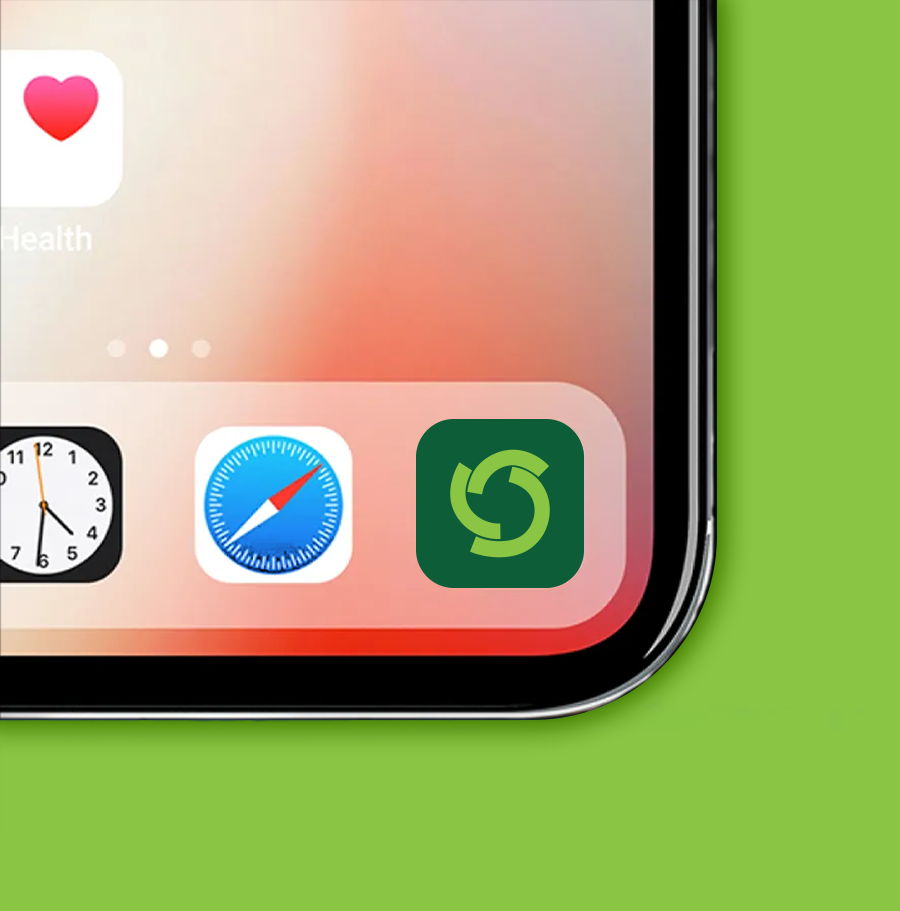
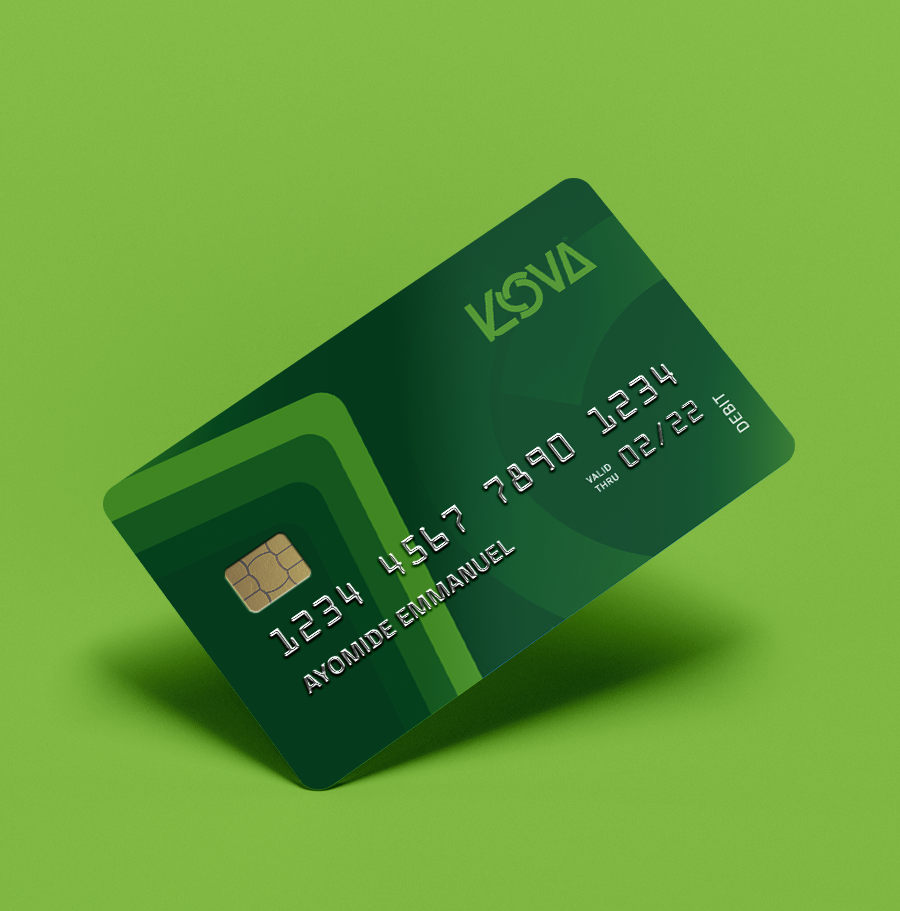
A complete brand identity system built on strategic research before any design work began. The name KOVA was drawn from Bantu roots meaning "to forge" — transformation, precision, permanence. The wordmark replaced the O with a circular exchange symbol — the platform's core function embedded directly in the identity. Deep Forest Green was chosen as the primary color after confirming no major African fintech brand owned it. Yellow-Orange was chosen as the accent — prosperity and warmth without the aggression of red. Every decision was documented and defensible.
Impact & Results
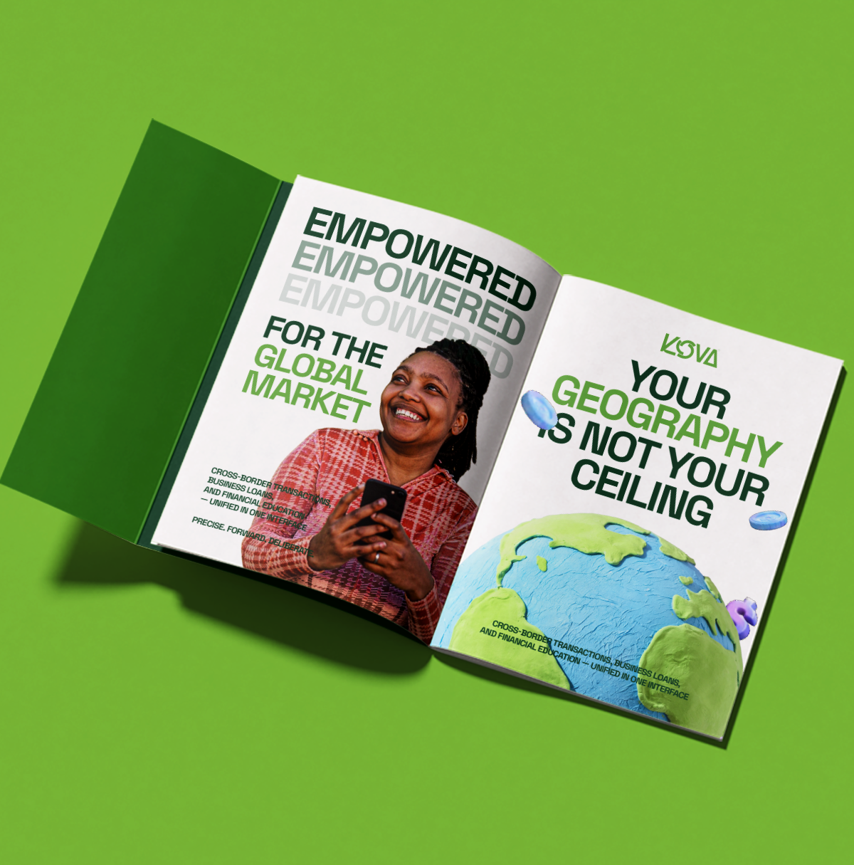
KOVA stands as the only African fintech brand identity built on this specific color combination — a deliberate gap in the market, confirmed through competitive research, and now owned entirely. The complete brand system delivered encompasses a full logo suite, color system, typography, pattern library, comprehensive brand guidelines exceeding forty pages, social media templates, virtual card design, and app UI direction — every asset needed to deploy the brand across every surface it will ever inhabit. The result is an identity with the range and confidence to walk into a Lagos pitch, a London investor meeting, and a Nairobi accelerator program and belong in every room.